Selected Works (2008–2018)
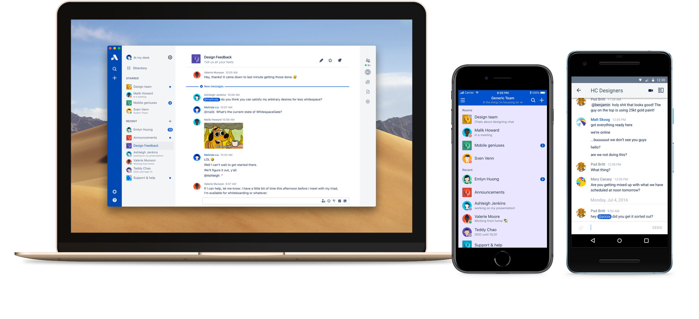
Stride, the successor to Hipchat, blended productivity and chat features to create an ambitious communication tool in an opinionated way. Being a lead designer on what turned out to be Atlassian’s biggest product launch ever was an incredible opportunity and I learned a lot along the way. As a design team, we built experiences across mobile and desktop platforms at the same time, allowing us to maintain parity between the mobile and desktop clients with few exceptions.
Stride was the first product to apply the latest iteration of Atlassian’s design language and the first product to feature the Atlassian product platform by including elements like actions, decisions, and mentions. Collaborating with other Atlassian teams across the world was a critical part of the design process.
Of course working on a chat product comes with a unique set of challenges ranging from the amount of elements on the screen at once to connectivity, real-time updates, and the surprising volume of notifications. It also proved to be very difficult to prototype, given the amount of feedback and context required to fully experience how someone might use the product. That all added up to very close collaboration with product management and various engineering squads.

In Stride’s very early form, we did some research on teams. At a high-level our goal was to learn more about how people think about teams, including how they define the word team, who’s “on their team,” and how often they communicate with their team and other teams. It was some of the most interesting research work I saw come out of Atlassian during my time there. Even though the project behind it didn’t get shipped, it was incredibly valuable context for Atlassian as they build more products and experiences for teams outside the software development space.
In the end, I think what I really took away from my experience working on Stride is a sense of the importance of pragmatism, in both design and product vision. Which, to me, doesn’t mean building less or cutting features but instead means navigating constraints to deliver a refined and polished experience to users that’s both easy to use and easy to build.
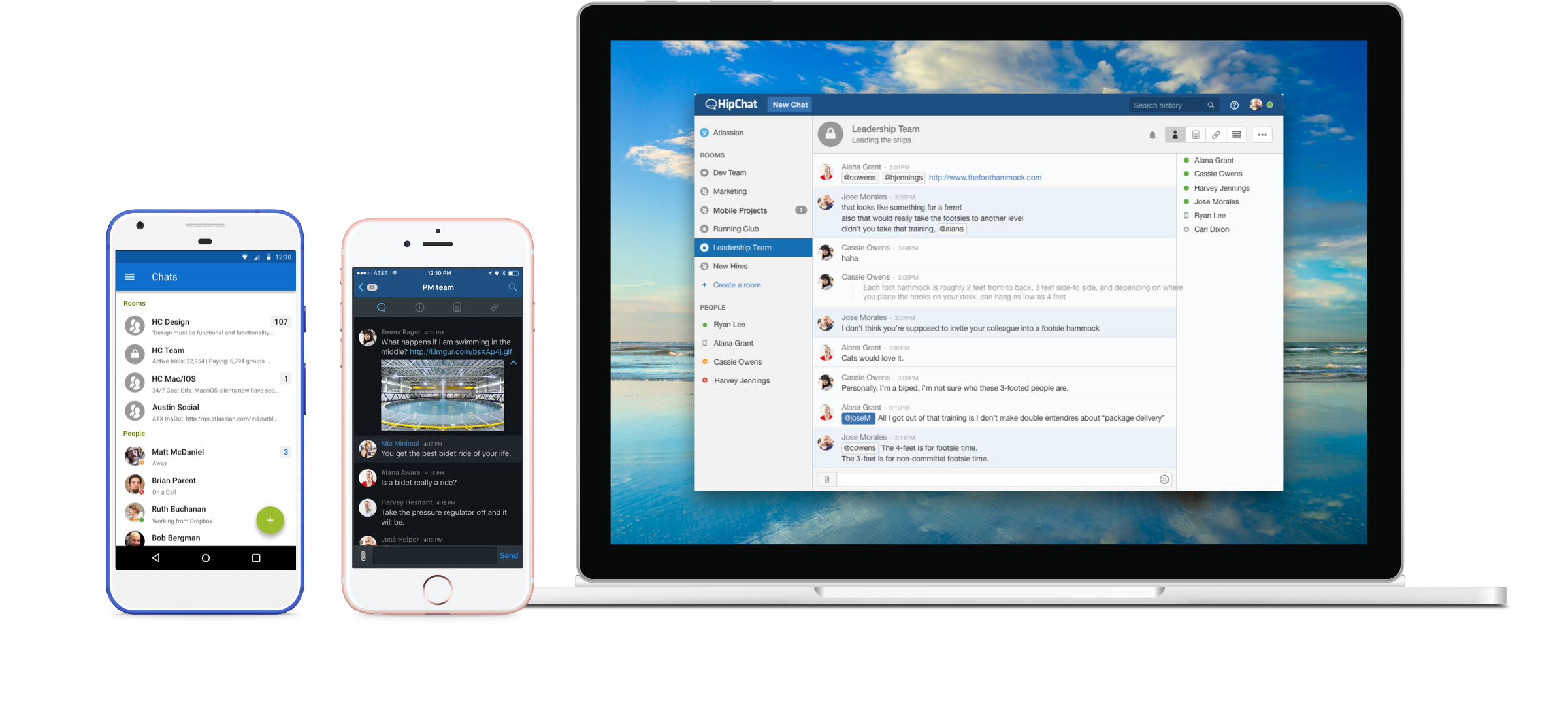
Atlassian’s first venture into the world of chat was Hipchat. Acquired before I joined, it was one of those software names that all the nerds at work knew. I jumped at the opportunity to do design work (and then redesign) Hipchat.
During a time when mobile at Atlassian was limited to a web-based Confluence app, the Hipchat team was designing, developing, and delivering a decent chat app across mobile and desktop simultaneously. As mobile grew at Atlassian, the Hipchat design team was able to influence what would eventually be called MobileCore and help them build a front-end toolkit to be used across Atlassian apps.
When I joined the Hipchat team at Atlassian, the product was sorely in need of love. The first project I took on was making Hipchat look and feel like an Atlassian product. Predictably, we got a lot of feedback about the change but ended up with a better experience overall that fit in with the rest of the Atlassian product family.
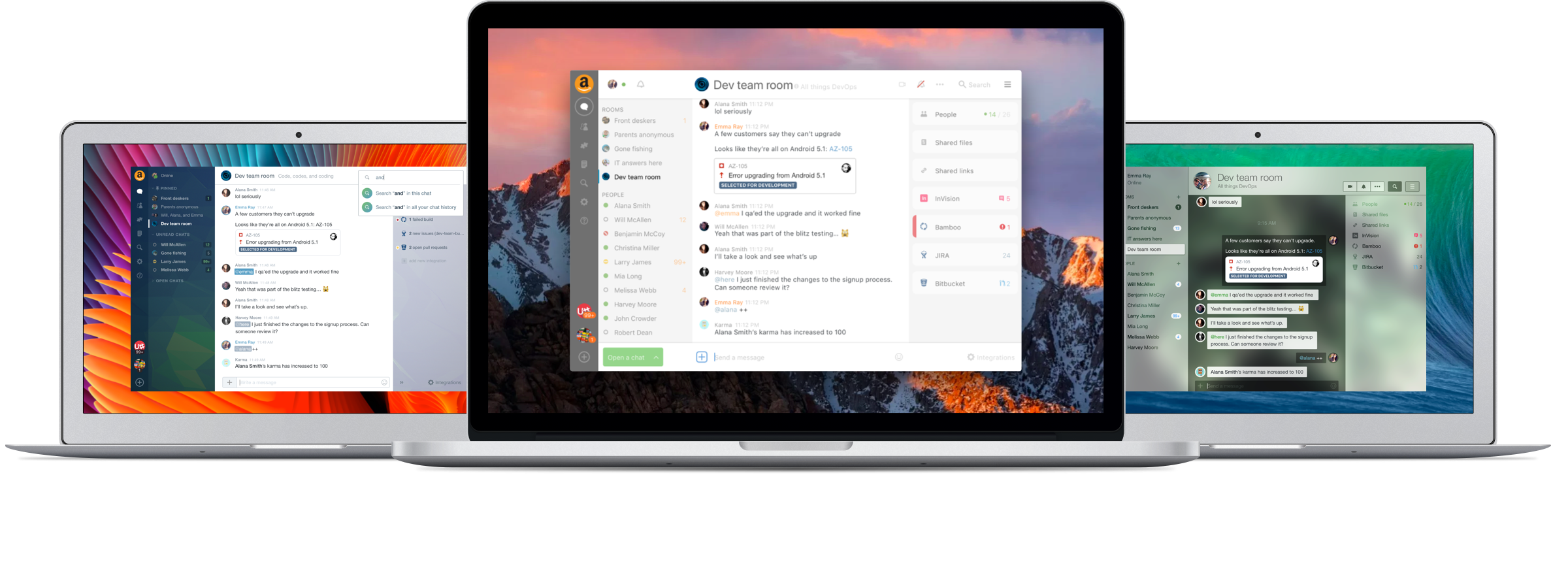
Hipchat had to be the most redesigned product at Atlassian during its time. New designers joining the team and engineers working on Ship-it projects often aimed their creativity at Hipchat — mostly out of love. I lead a handful of redesign spikes: some focused purely on visuals, some on just the interactions, and some tackling both ends. As time went on, all those redesigns came together to form Stride.
Being the only designer in the Atlassian Austin office at the time, I was at the heart of building what turned out to be an incredible design team. We also grew by importing teammates from Sydney and integrating the Hall team. Though this transition was complicated at times, looking back, I was able to experience a wide array of team rituals, sharing of work and knowledge, and onboarding efforts that I think left me better equipped for the joining a growing team in the future.
There’s a running joke at Atlassian that it’s a t-shirt company that makes software and I’m proud to say that I contributed to that notion by printing a bunch of team shirts, product shirts, and event shirts for Hipchat, Stride, and Atlassian. The Hipchat team shirts aren’t anything special at first glance, but the color combinations were all hand-picked based on feedback from the teams directly, printing six or more different colorways each run. The process ended up with a variety of shirts instead of the typical white-logo-blue-shirt, and got the team invested and excited about shirts coming out. I quickly realized that we were printing a ton of shirts and that we were extremely fortunate to be able to do so, so I turned it into a food drive. Two cans of food in exchange for a team shirt. With this new initiative, well over 100 pounds of canned food were donated to the Central Texas Food Bank every time I had a run of Hipchat shirts printed.

Being a core member of the Hipchat and Stride design teams meant I was often working closely with the Sydney design systems team as well as the mobile teams in Austin and San Francisco to help shape the future of our central product experiences across Atlassian. Being able to do that effectively required a number of spikes with a handful of different teams in which I’ve played both contributor and facilitator. Some were co-located and some I handled remotely with teams across the globe.
One of the more unique design projects at Atlassian was picking sounds for what ultimately turned out to be Stride. I worked closely with a sound designer on-staff and an outside contractor to find the sonic identity of Atlassian. After a year of iterations, reviews, and surveys to rank choices and pick defaults, we ended up with the six sounds available in Stride. I put together a retrospective talk looking back at the options we explored and laying out some of the hidden lessons learned for Atlassian Design Week 2018 that garnered several pats on the back and a bunch of high-fives.
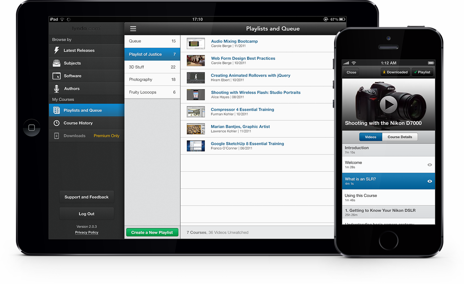
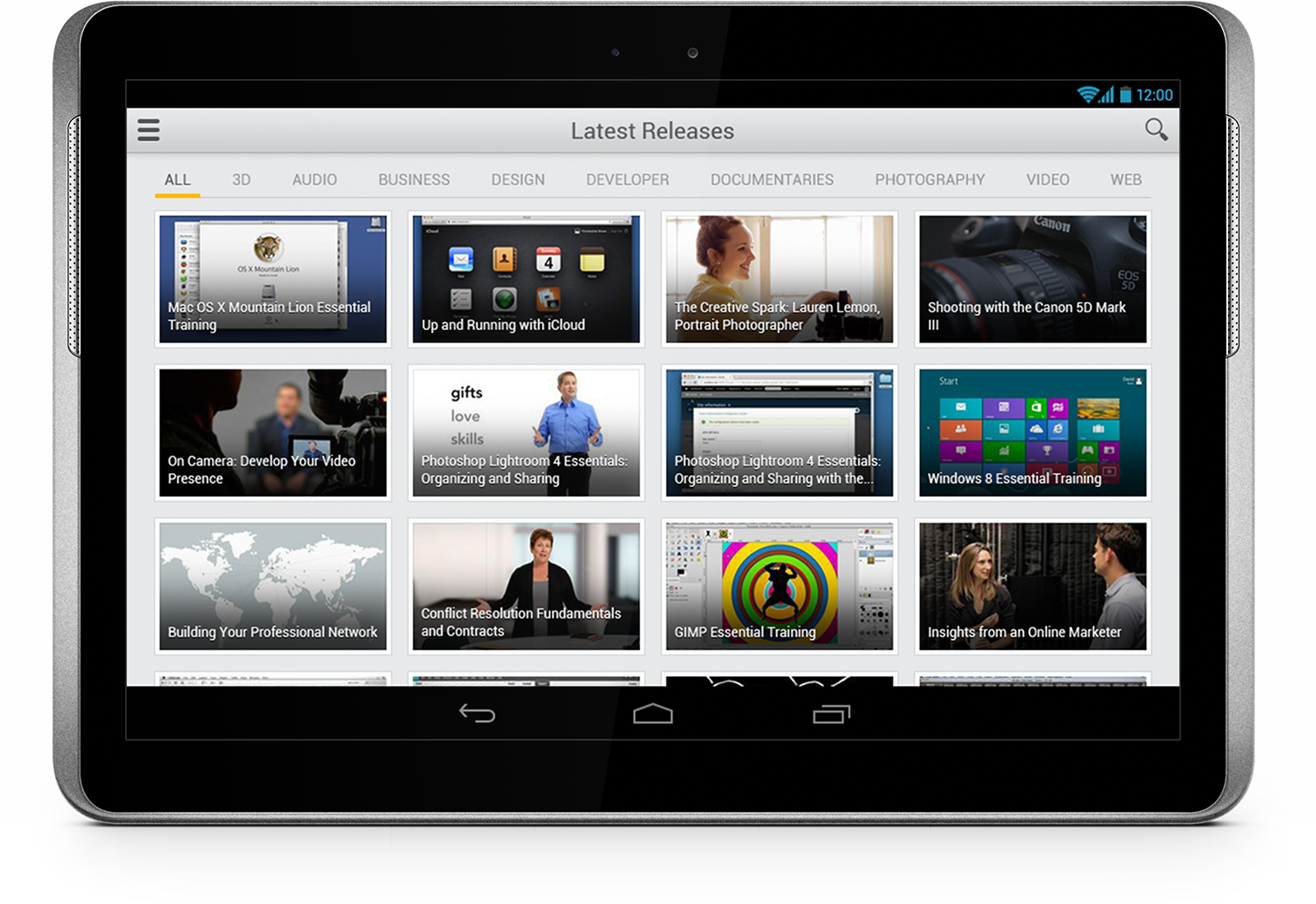
At Mutual Mobile, I created three mobile products for lynda.com, collaborating with lynda.com directly. I helped them reinvigorate their iOS application for a version 2.0 release on both iPhone and iPad, and lead the design of their 1.0 Android application.
During the iOS phase of the project, an interaction designer and I teamed up to define features and requirements during a discovery phase and I iterated on visual designs with lynda.com — occasionally with Lynda herself — over the course of a couple months. After the launch of 2.0, we were over the MVP line and we started implementing more features and I got the chance to clean up and improve some of the designs.
The Android side came with all the unique challenges that an Android project normally does: fluid layouts, animation performance, resolution-independence, wider range of asset sizes, and so on. During that time, I was leading a team of designers (three including myself) and was then actively leading the vision on both platforms. Both tailored to their specific systems.
Creating the cross-platform mobile companion to Escort’s top-of-the-line radar detectors was an exciting and fun challenge. It won several awards at CES the year Escort Live was unveiled. I especially love how well the dashboard turned out — even if I'm still a little bitter about having to put media controls in there.
The dashboard has six different themes: dark and light blue (really just cool greys), dark and light amber, and dark and light pink. The client pushed for the amber and pink but the dark and light variants came from testing the thing. Kevin Harwood, the lead developer on the project and I drove around and tested things like legibility and how big targets needed to be in a moving vehicle and the performance of the connection between the radar detector regularly. What we found was that, in direct sunlight, most of the dark interface was lost. Thus, the light version was born. It's a toggle or you can set it to switch automatically based on time.
My favorite parts of the dashboard are the radial graph bars (to replace a traditional speedometer needle) and the driving mode lights that mimicked Escort's radar detectors. The radial bars proved to be a challenge (geometry and assets) for both iOS and Android but it was worth it and they turned out great. Each frame of the animation on those lights was made in Photoshop and I'm particularly proud of the effect when the lights hit the left and right edges — probably because of the amount of time I spent doing it.
At the time, of course, the whole skeuemorphic thing was the trend. I love how it turned out, but if it was built for iOS 7, I can't help but feel like it'd lose some of it's charm.
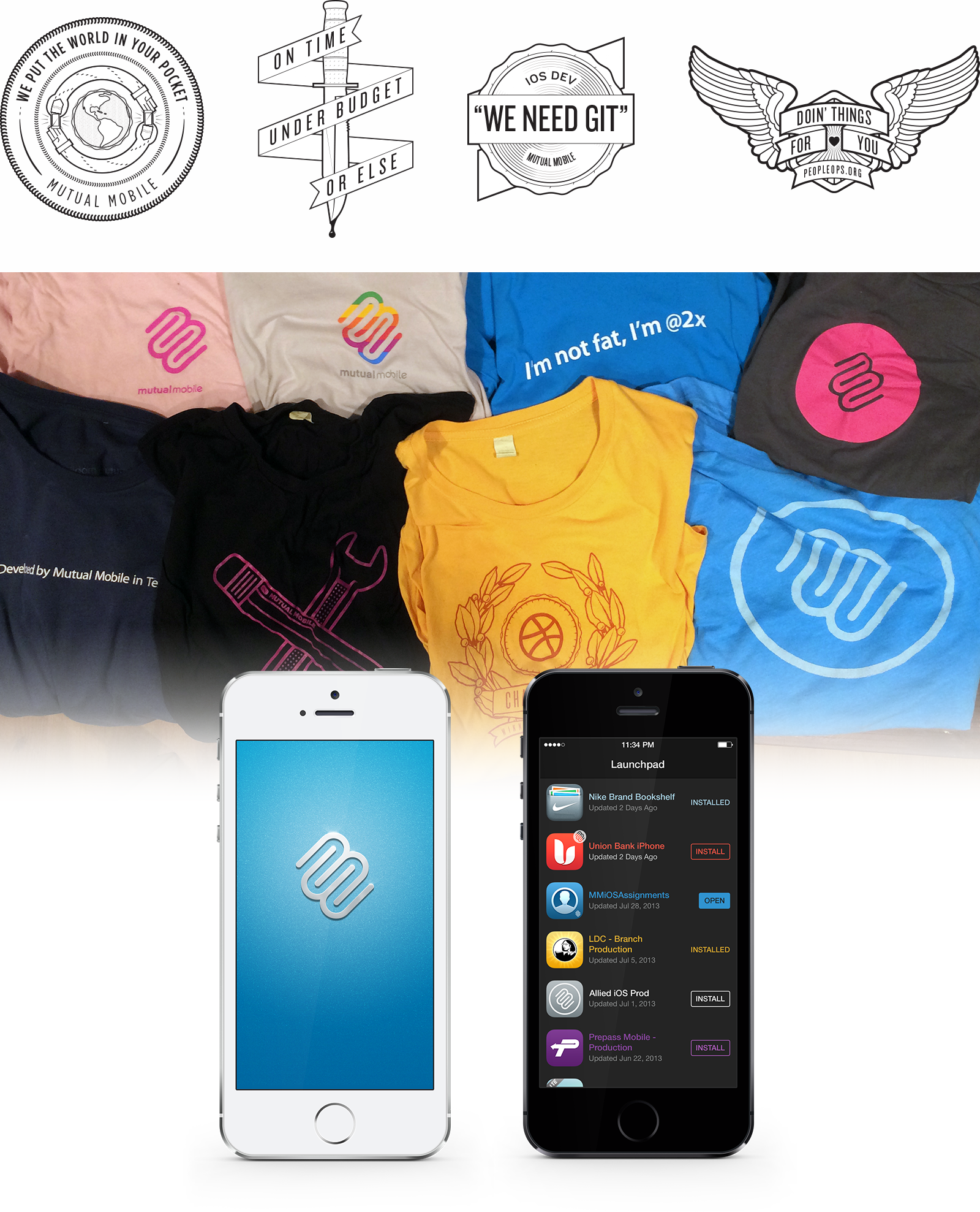
I’m very proud of the contribution that I made to Mutual Mobile’s brand and culture and I’m grateful for the opportunity they made available for me to make a difference.
I created a dozen or so shirts while I was there. The brand ones were simple because I think the complicated mark has enough visual interest by itself. I have some of the shirts below. They are, in order of appearance:
I also designed a numbering and signage system for the main floor's 24 conference rooms that reportedly “made everyone feel smarter”. What more could you ask for from a sign?
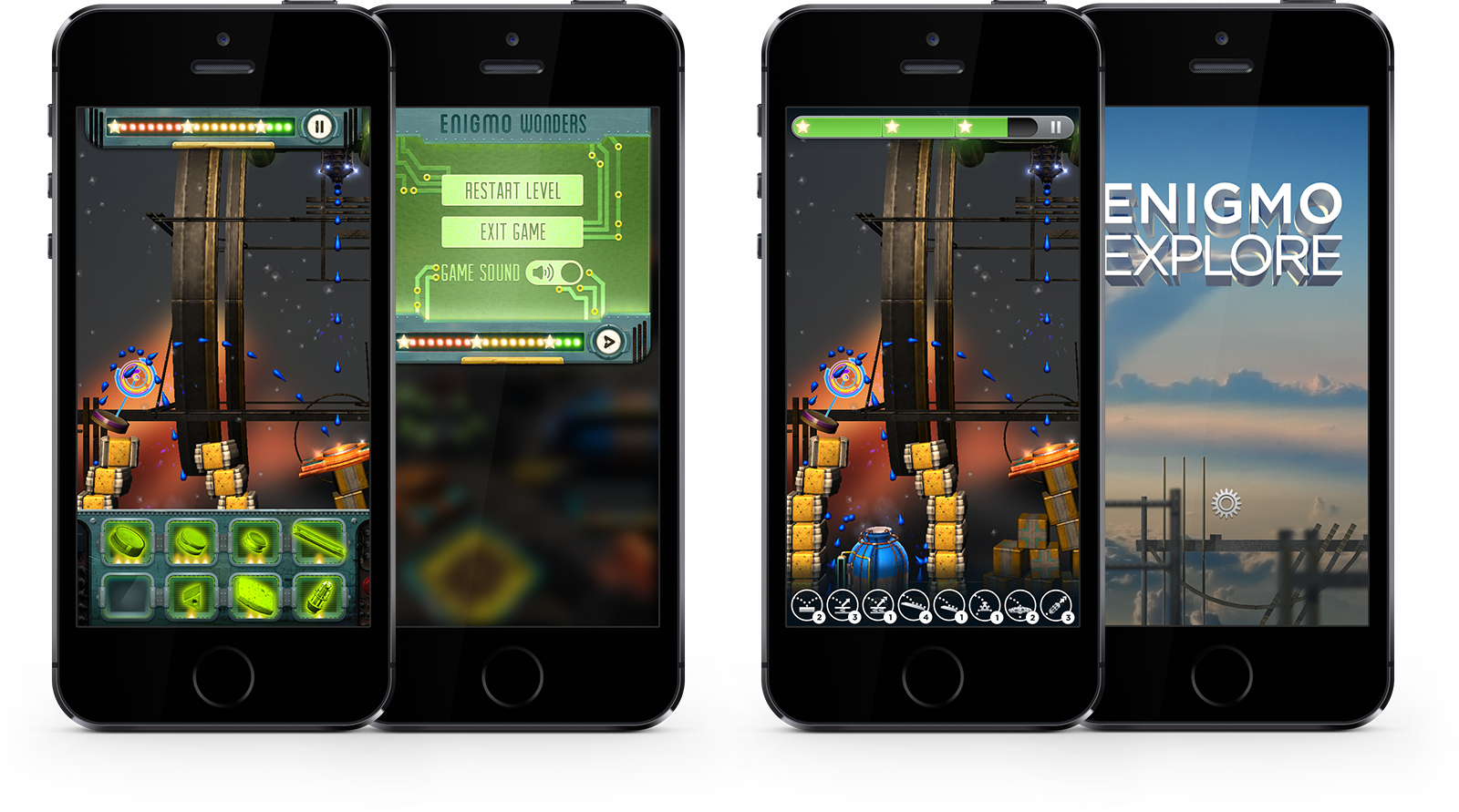
My second opportunity to do real game UI design was an interesting one. After a few revisions on the UI, we had something we were all happy with. I also created the original concept for the game’s branding.
I went down the road of making real-looking things in a few different directions. None of it really sat right, though I think there are little moments throughout those visual designs that are really nice. As a team, we talked about how to simplify everything, trying to not compete with the game UI. It ended up pretty simple and much more flexible.
In the end, a 3D artist came in and gave more life to the branding and added a few touches to the UI, bringing in elements he created for the game, but I like to think that my concept and contributions were meaningful ones.
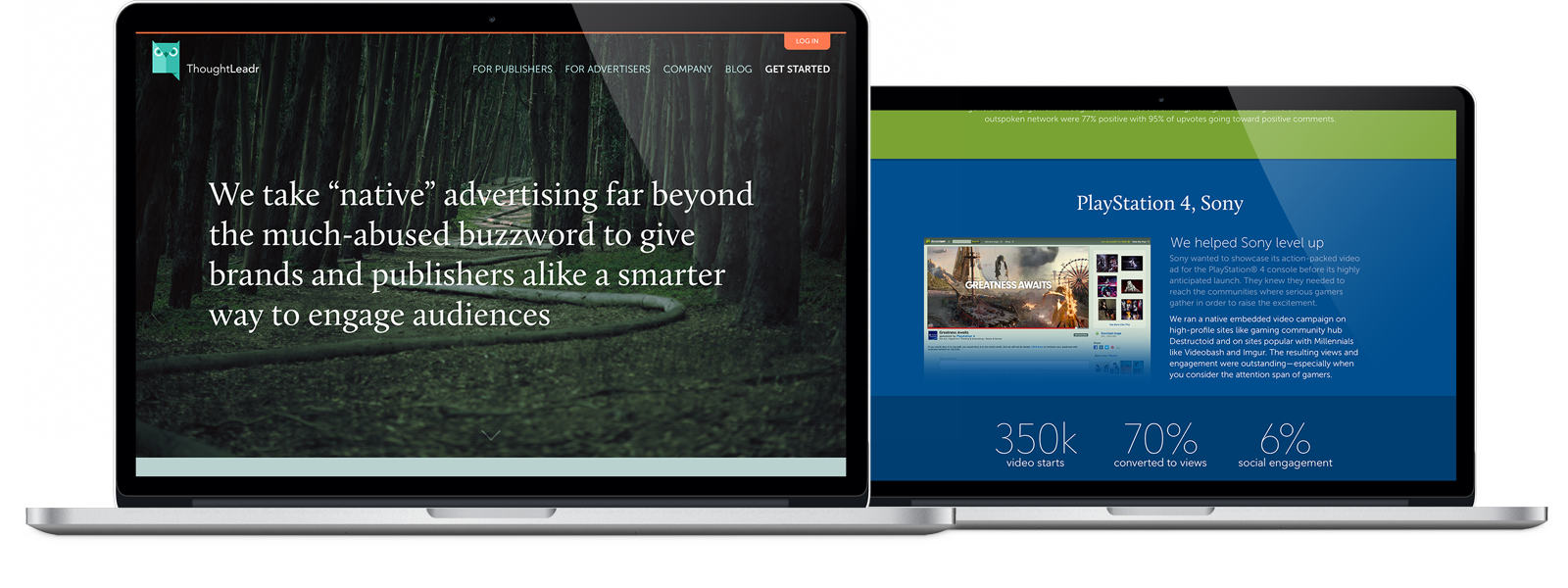
During my time at Chaotic Moon, I was given the opportunity to redesign the desktop web experience for native advertising group Thought Leadr. I worked directly with Adam Lipman, CEO of Thought Leadr and COO of Chaotic Moon, and the rest of the Thought Leadr team to create a great experience that uplifted the brand with a clean, professional, direct concept spread across several templates, each with a different theme color.
The Thought Leadr guys had gone through a few different designers and I was brought in to work on the visual brand language and web site to convey a more professional, big-boy feel. Using large spacings to focus on little pieces of content and colors for each theme, I was trying to make sure that people wanted to read the content while reducing the amount of things that were said. Really, just bringing the content into a more modern age from where they were before I got involved.
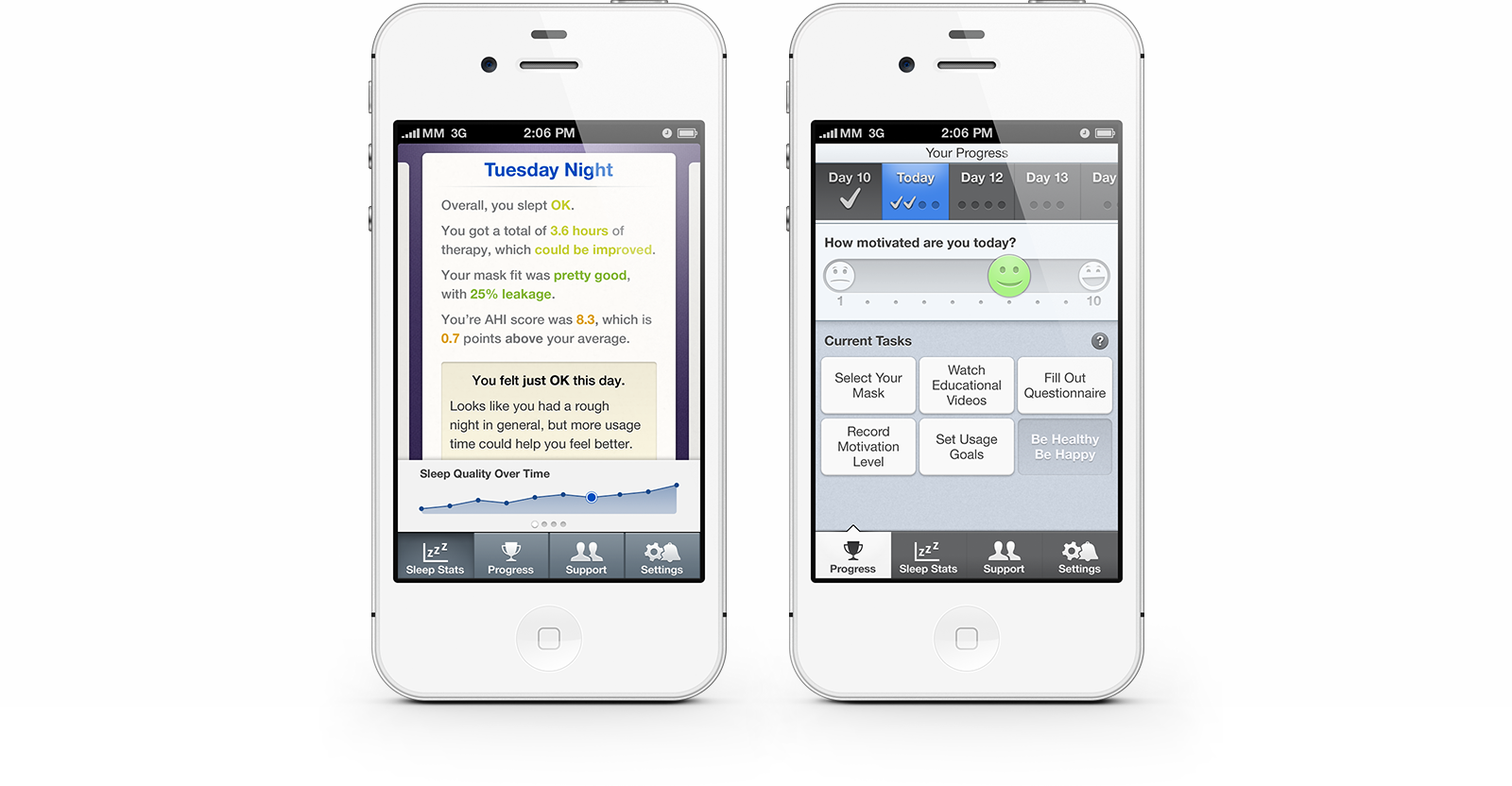
Philips came to Mutual Mobile for help designing and developing a product that tries to encourage people get in the habit of wearing their life-saving but uncomfortable sleep apnea mask. We presented several concepts to the Philips Respironics team; here's a look at a couple:
As managing partner and chief designer at Red Paper Sack, I created the brand and performed all design tasks. We released our own mobile products and did design and some development work for clients. The name came to the other founder, Chesley, in a dream.
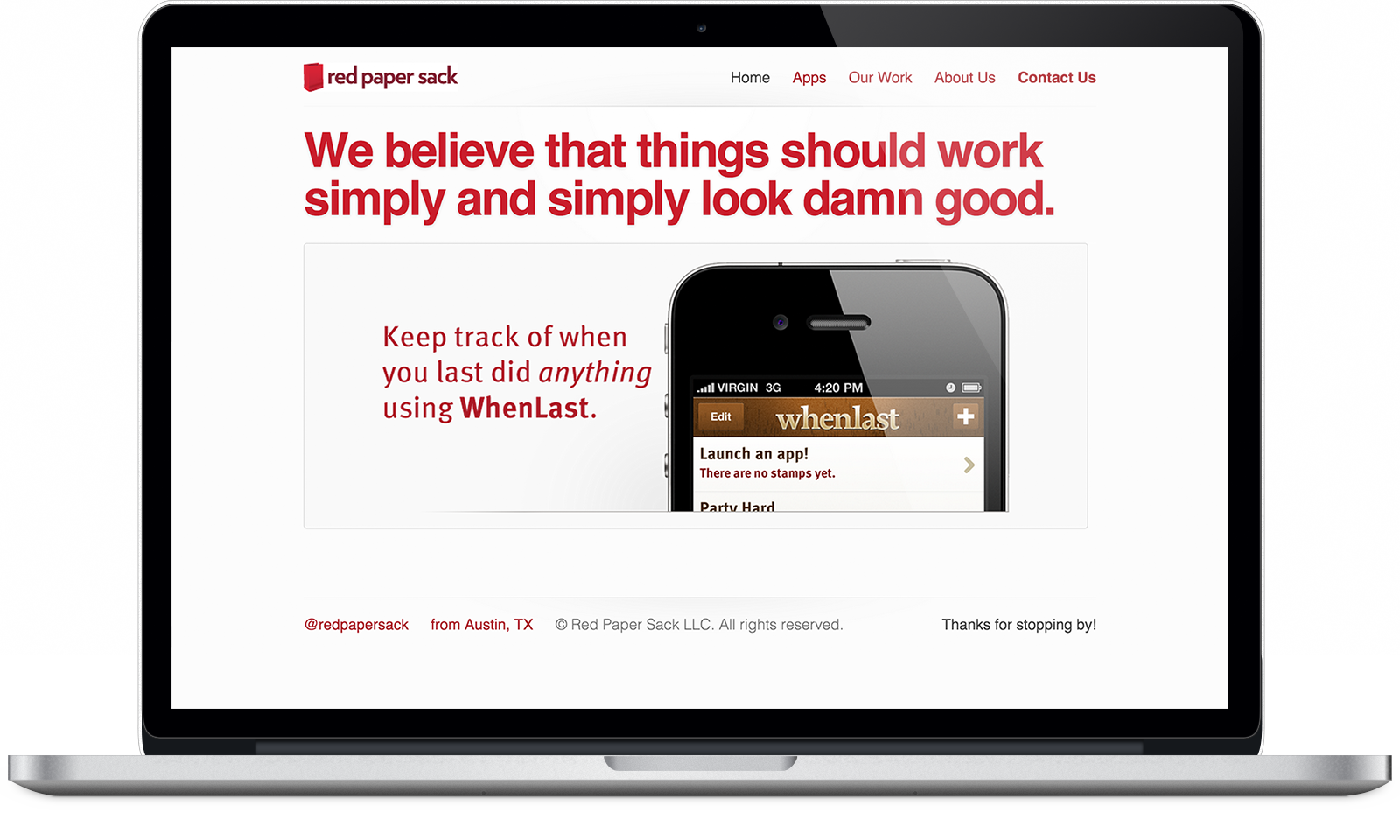
The brand was very human. Conversational. And, even though the Typekit license has expired and I cringe at a few line breaks, I still think the site looks pretty good — though most of my older web work isn't included here for a reason. The only thing I regret is we never got around to making shirts.
We were nervous about putting the word “damn” on our home page. Chesley's mom, in particular, didn't like the idea. I'm glad we kept it. I don't think it'd be the same without it and I felt strongly about it, damn it!
WhenLast is for keeping a record of when something last happened. It's a simple idea that needed great execution that didn't complicate the process. After keeping track of things by writing out times and dates in a Notes file, this proved to be a better way to track when you last did something.
Some Clients and Teams I've Worked With

Thanks for taking the time to scroll all the way down here. Really.
Hit me with a Twitter DM or email if you want to work together or just, you know, feel like talkin' about stuff.
